

What a placement cell should actually measure
Ztwin
Every placement cell is asked the same question, usually in April, usually by someone who wants one number: what percentage did we place?
It is a fair question. It is also close to useless for running the cell, because by the time you can answer it the year is over. A percentage is a scoreboard. What a cell needs during the season is a dashboard.
The gap matters more than it used to. Deloitte's Campus Workforce Trends 2025, drawn from over 200 organisations and data across 500-plus campuses, describes campus hiring moving toward skill-first selection with a roughly 38% expected surge in GenAI use across resume screening, assessments and evaluations. 1 Mercer | Mettl, assessing over a million students across 2,700-plus campuses, put overall employability among graduates applying for jobs at 42.6%. 2 Both say the same thing to a placement officer: what a student can demonstrate is now decided long before the drive, and one end-of-year percentage cannot see any of it.

The short version
- The percentage is an outcome, not an instrument. It arrives after every decision that could have moved it has already been taken.
- Track participation before you track selection. Eligible-but-not-applied is the earliest warning a cell gets, and almost nobody records it.
- An average readiness score hides the batch you actually have. Two batches averaging 62 can need opposite interventions.
- Conversion at every stage is the one measure that localises the problem. A percentage says the season went badly; a funnel says which stage did.
- Repeat recruiters are the only measure a bad year cannot fake.
- The metrics are easy; the data foundation is the hard part. Every one of these is a week of manual work if the record is scattered, and nearly free once it is single.
What this article covers
- Why the placement percentage cannot run a placement cell
- Six measures worth tracking
- What each drop-off point usually means
- What NIRF and NAAC ask for is not enough to run on
- The metric is easy, the data foundation is not
- What a placement dashboard should answer
- Where AI helps, and where it does not
- From placement reporting to placement intelligence
- Frequently asked questions
Why the placement percentage cannot run a placement cell
A placement percentage is a single figure, computed once, describing something that has already finished. It is the right number for a report and the wrong number for a Tuesday.
The questions a cell actually has to answer during a season are different in kind: what is happening right now, and what can still be changed? Where are students dropping out of processes? How long are they waiting between stages? Which group is falling behind, and is it the group anyone expected? Are employers coming back?
None of those are visible in a percentage, and all of them are visible weeks or months before it can be calculated. The measures below are chosen on exactly that test — each one can be read while there is still time to act on it. (Why the placement office ended up a season behind the job it is now asked to do is a separate argument.)
Six measures worth tracking
1. Eligible-but-not-applied
For every open drive, how many students met the criteria and did not apply?
This is the single highest-yield number in a placement cell, and almost nobody tracks it. A student who was eligible for four drives and applied to none is not a data point at the end of the year — they are a phone call this afternoon.
If the figure is above ten per cent of the eligible pool, the cause is almost never student apathy. It is that they found out too late, or the criteria read as stricter than they were, or the form was confusing, or nobody told them they qualified, or they had already decided they would not clear it.
The goal is not to push every eligible student into every process. It is to know where participation is being lost, and to find out before the outcome is decided rather than after.
2. Time-to-shortlist
From the day a drive closes to the day the shortlist reaches students.
Recruiters notice this. Students notice it more. A cell that takes eleven days to publish a shortlist trains its students to stop checking, and then everything is back on WhatsApp.
Track the median, not the average — one delayed drive should not hide twenty fast ones. And track it at each interval, not just end to end: announcement to close, close to assessment, assessment to shortlist, shortlist to interview, interview to result, selection to offer. Different employers will always run at different speeds, so the point is not a uniform timeline. The point is that when one interval is consistently the slow one, that interval is the bottleneck and it is usually inside the cell rather than inside the company.
3. Readiness distribution, not readiness average
An average readiness score across a batch of 600 tells you nothing. The distribution tells you everything.
Two batches can both average 62. One has everyone clustered between 55 and 70. The other has a third of the batch above 80 and a quarter below 40. Those two batches need completely different interventions, and the average hides which one you have.
So look at the spread rather than the centre: readiness by department, by target role and by skill; the bottom quartile by name; who has moved since the last assessment and who has not. The bottom-quartile list is your term plan.
One caution that gets more important as employers move toward skill-first hiring: readiness is not a single universal score. A student can be well prepared for one role and poorly prepared for another, so the useful question is not how employable is this student but how ready is this student for the roles we actually expect this year.
4. Offers per placed student
If forty per cent of your offers are going to twelve per cent of your students, your placement percentage is being carried by a small group who would have been placed anyway.
This is not a reason to hold those students back. It is a reason to know it, because it changes what the number means — and it will come up the first time someone compares your percentage with the college down the road.
The three counts worth keeping beside it are students with multiple offers, students with exactly one, and students with none. The last group is the one the percentage is least informative about and the one the cell can still do something for.
5. Repeat recruiters
What share of this year's recruiters also came last year?
Placement percentage measures the season. Repeat rate measures whether the season was good enough that anyone wants to come back. It is the closest thing a cell has to a quality signal, and it is the one number a bad year cannot fake.
Kept properly it is a small table rather than one figure: total recruiters, new, repeat, retention rate, students hired per recruiter, roles hired for, offer-to-joining conversion. That is the difference between building an employer network and replacing one every year.
6. Conversion at every stage
The measure that ties the other five together. Treat the season as a funnel and record the count at every step:
Eligible → applied → appeared → shortlisted → interviewed → selected → offer accepted → joined.
The placement percentage is only the last ratio in that chain. The chain itself is what localises a problem. "Our placement percentage dropped" is not something anyone can act on. "Application rates held, but interview conversion for analytics roles fell by half" is a problem with an owner and a deadline.
What each drop-off point usually means
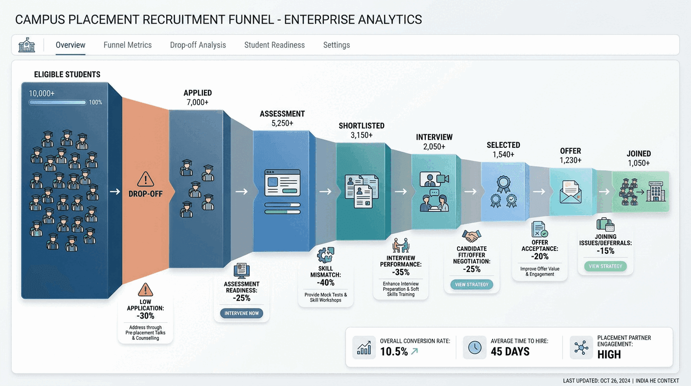
Read the funnel by where it narrows rather than by how much it narrows overall:
| Where the funnel narrows | What it usually points to |
|---|---|
| Eligible → applied | Awareness, deadline clarity, role fit, process friction, or students who have written themselves off |
| Applied → appeared | Scheduling, communication, clashing academic commitments |
| Appeared → shortlisted | Assessment readiness — aptitude, technical depth, or a mismatch between what was practised and what was tested |
| Shortlisted → interviewed | Coordination and logistics, usually the cell's own calendar |
| Interviewed → selected | Interview performance, structured communication, role-specific preparation |
| Selected → joined | Offer attractiveness, competing offers, location, compensation, employer fit |
Each row is a different intervention. That is the whole argument for tracking the funnel: the same fall in placement percentage can come from any of six causes, and the response to one is useless against another.
What NIRF and NAAC ask for is not enough to run on
Institutions already report placement numbers formally, and the shape of that reporting is worth understanding — because it explains why so many cells measure only the outcome.
NIRF scores Graduation Outcomes at a quarter of the total, built from a combined placement and higher-studies metric, a university-examination metric, and median salary of graduates over the previous three years. 3 NAAC's affiliated-college framework scores placement under Criterion 5.2.1 as the percentage of outgoing students placed or progressing to higher education over the last five years. 4
Both are legitimate and both are lagging by design — a five-year window is meant to smooth out a single bad season, which is exactly what makes it useless for managing one. A cell that measures only what it reports is measuring on a five-year delay.
The distinction worth holding onto: reporting answers what happened. Management needs what is happening, and what should we do next. A placement cell needs both sets of numbers, and only one of them arrives on its own.
The metric is easy, the data foundation is not
None of the six measures above are hard to define. Collecting the underlying data consistently is the entire difficulty.
Student registration lives in one system. Applications happen through a Google Form. Assessment results come from another platform. Shortlists arrive by email. Interview results get shared over WhatsApp. Offer letters sit in individual folders. Employer history exists in a spreadsheet, and one officer is the only person who knows what happened between the rows.
Which turns an apparently trivial question — how many eligible students did not apply to this drive? — into a week of work, because answering it requires the complete eligible list, the final application list, the same student identifier across both, the drive and deadline record, and some reliable way to tell "did not apply" apart from "was not eligible after all".
The measures come almost free once the record is single. That is the constraint worth fixing first, and it is the same constraint behind the placement cell's bigger problem.
What a placement dashboard should answer

No officer should need five spreadsheets and a WhatsApp search to answer a basic question. A useful dashboard covers four areas:
Students. Who is ready, and ready for which roles? Who is improving? Who needs intervention now?
Drives. Who was eligible, who applied, where did students drop out, how long did each stage take, where is the bottleneck?
Employers. Which companies are returning? What roles and skills are they asking for?
Outcomes. Who was selected, how concentrated were the offers, how many students joined, which employers came back?
Those four answers together are a far better description of placement performance than one percentage, and every one of them is available before the season ends.
Where AI helps, and where it does not
The useful test is not whether a tool uses AI. It is whether it reduces the cell's workload while improving a decision. On that test, a few things hold up: continuous assessment instead of one annual snapshot; interview practice at volume with structured feedback; missing-keyword and skill-gap detection against a real job description; and funnel analytics that flag an unusual drop-off while the drive is still running.
Two cautions. A readiness or ATS score computed with no job description attached is decoration — the comparison against a specific employer's requirements is the entire content of the number. And nothing here replaces the placement officer: employer relationships and judgement about individual students are the work, while assessment at volume and gap analysis are the load. Moving the load is the point, and the employability layer that argument leads to is set out separately.
From placement reporting to placement intelligence
The traditional placement dashboard looks backward and asks how many students were placed. A useful one looks forward and asks where students are getting stuck, which roles they are ready for, which skills employers are asking for, which interventions moved the numbers, and which companies are coming back.
That is the difference between placement reporting and placement intelligence. The percentage will always matter — but it belongs at the bottom of the dashboard, not at the top, because by the time it can be calculated the cell has already finished the season.
Measure the funnel. Measure readiness by distribution. Measure employer relationships. Measure where students get stuck, and act while the result can still change.
Frequently asked questions
What is a good placement percentage for a college?
There is no clean benchmark, and comparing raw percentages across institutions is usually misleading — the figure depends on which students are counted as eligible, whether higher studies and entrepreneurship are included, and how offers are attributed to students with several. A percentage is only interpretable next to the offers-per-placed-student figure and the eligible pool it was computed from.
What placement data do NIRF and NAAC require?
NIRF's Graduation Outcomes block combines a placement and higher-studies metric with a university-examination metric and median salary of graduates over the previous three years. 3 NAAC scores placement under Criterion 5.2.1 as the percentage of outgoing students placed or progressing to higher education over the last five years. 4 Both are reporting metrics measured after the fact, which is why a cell needs operational measures alongside them.
How do you measure student placement readiness?
Against a role, not in general. Readiness is the distance between what a student can demonstrate and what a specific job description asks for, so the same student can be well prepared for one role and unprepared for another. Practically that means assessment results tied to target roles, tracked as a distribution across the batch, with the bottom quartile identified by name.
What should a placement cell track weekly during the season?
Three things: eligible-but-not-applied on every open drive, the time each drive has spent at its current stage, and the conversion counts at every step of the funnel. All three can be acted on the same week. Placement percentage, offers per placed student and repeat-recruiter rate are season-level measures reviewed at the end.
Sources
Footnotes
-
Deloitte India, Campus Workforce Trends 2025 — insights from over 200 organisations and data across 500+ campuses; reports a ~38% expected surge in GenAI use across resume screening, assessments and evaluations, a 24% jump in PPOs and ~15% growth in hiring budgets in FY25. ↩
-
Mercer | Mettl, India's Graduate Skill Index 2025 — over one million students assessed across 2,700+ campuses; 42.6% of graduates applying for jobs assessed as overall employable. ↩
-
NIRF India Rankings framework (Colleges) — Graduation Outcomes carries a ranking weight of 0.25, comprising the combined placement and higher-studies metric (GPH, 40 marks), university examinations (GUE, 40) and median salary (GMS, 20), the last computed over the previous three years. ↩ ↩2
-
NAAC, assessment and accreditation manuals — the affiliated-college framework scores metric 5.2.1 as the percentage of outgoing students placed or progressing to higher education during the last five years. ↩ ↩2